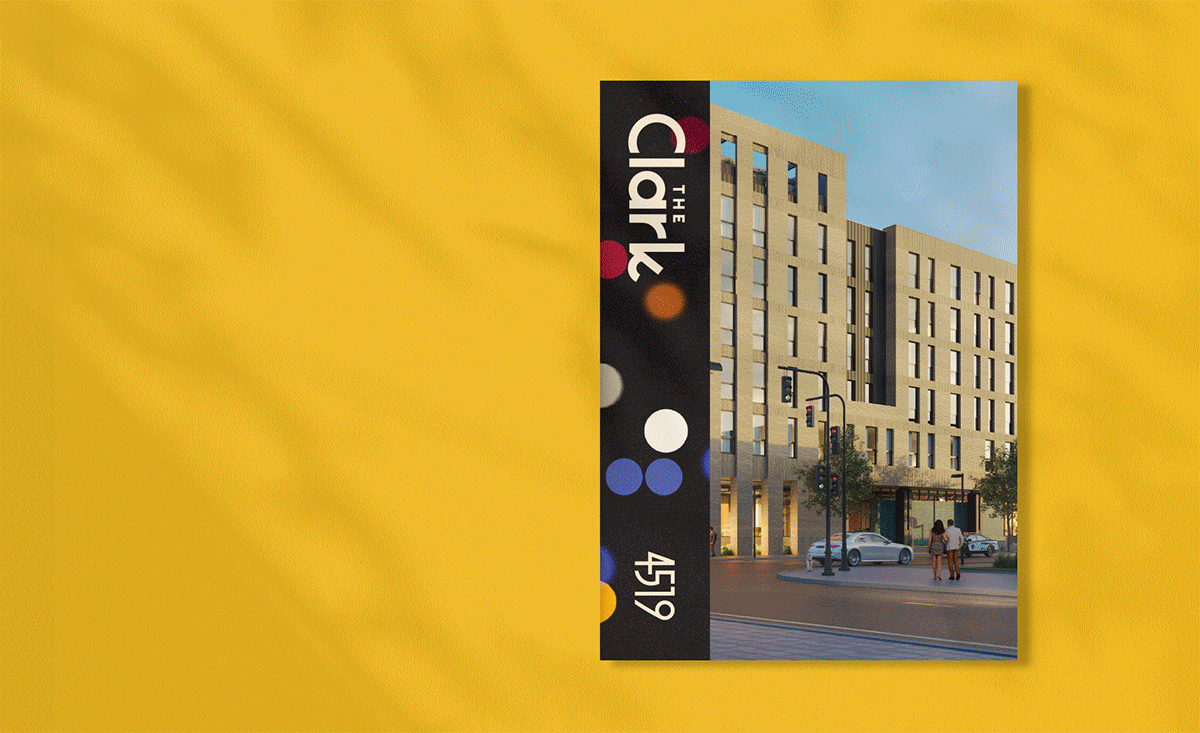
The ClarkA Visual Identity for New Apartments in West Philadelphia that Pays Homage to the Building’s Namesake.
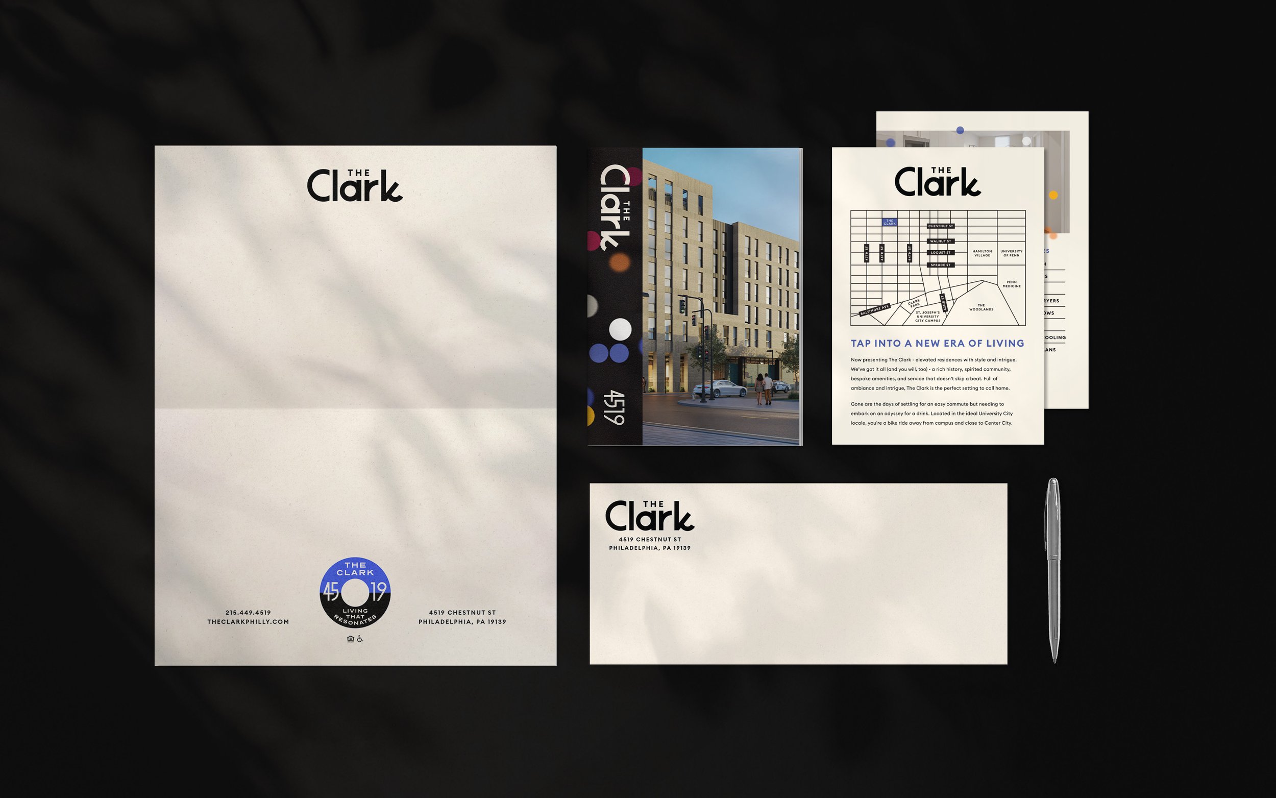
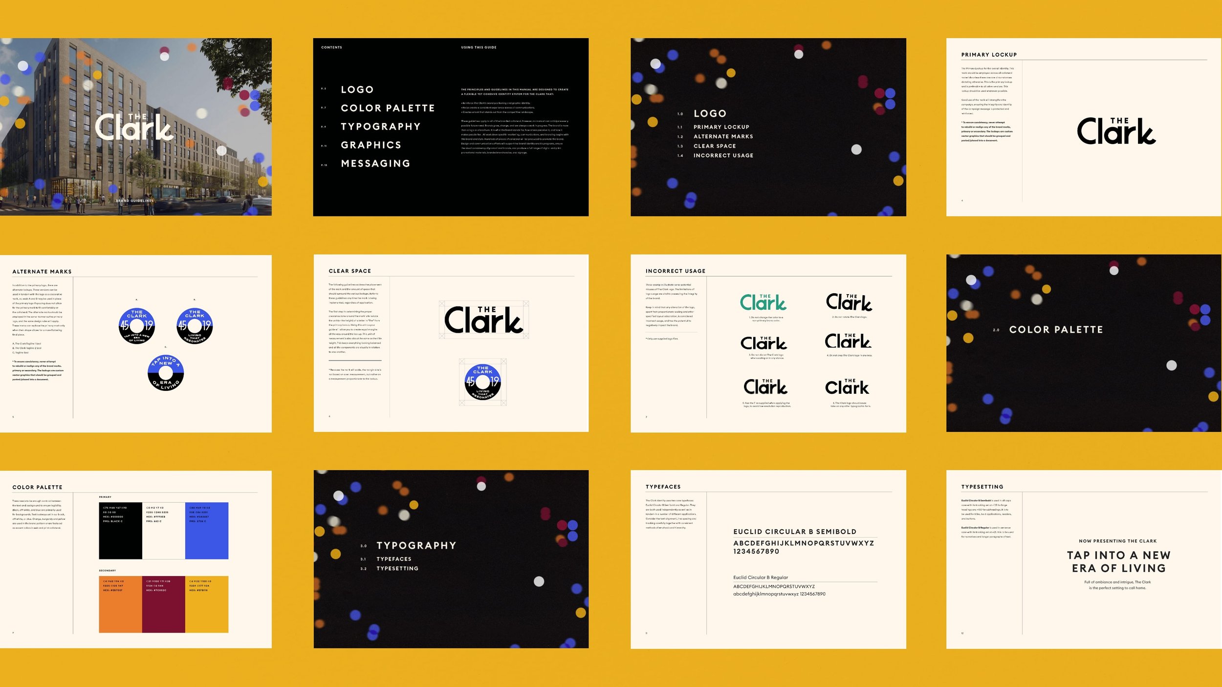
Just around the corner from the birthplace of Dick Clark’s American Bandstand, The Clark needed an identity that balanced its modern architecture with a nod to the area's iconic history. Using custom design elements, we developed a sophisticated branding system that echoes the music and design trends of past decades.
+ client: eqt exeter
+ lead designer
+ studio: the heads of state


tap into a new eraReferencing music of the 1950s and 60s, we designed a seal in the style of a 45 record label and created brand pattern evocative of album cover artwork of the time.


project details-
Brand Strategy
Custom Wordmark & Seal
Visual Identity & Brand Guidelines
Writing
Stationery
Brochure
Signage -
Studio – The Heads of State
Creative Direction – Dusty Summers
Design – Anna Williams
Building Developer – EQT Exeter
Building Management – Greystar -
2023
-
// Design //
Working as the sole Designer in a duo with a Creative Director in a small studio, I had the privilege of being hands-on involved in every step of the process from initial mood explorations and logo concepts to the execution of final brand touch points and guidelines.